Personal project · Redesign concept

CLiQQ, a clearer interface with a friendly visual identity

A personal redesign exploring how CLiQQ's shopping, payment, and rewards experience could become easier to navigate through clearer information hierarchy, consistent UI, and custom illustration.

This project is not affiliated with or commissioned by 7‑Eleven. The screens and proposed features represent my own design exploration.
Role
Product Designer & Illustrator
Duration
3 months
Focus
UI, visual design, iconography, illustration
Tools
Figma, Illustrator, Fresco, Procreate, Notion
Overview

Payments, points, rewards and deals in one app

CLiQQ brings together 7‑Eleven's digital payment services, loyalty points, rewards, and deals. As the sole designer on this personal project, I explored how to organize these features into a clearer mobile experience.

My work covered reviewing the existing interface, gathering exploratory feedback, redesigning the screens, and creating custom icons and characters. The goal was to give everyday actions a clearer place in the interface while developing a cohesive, approachable visual identity.

The challenge

Useful services, hard to find

The existing app offered useful services, but its crowded layouts and unclear navigation made some features difficult to locate. Understanding how points, rewards, and deals worked was another area for improvement. I focused on three questions.

1

How could users find payment and shopping services more easily?

2

How could the interface explain points and rewards more clearly?

3

How could the visual design feel friendly without distracting from important tasks?

Reviewing the existing experience

Four themes from feedback

I reviewed app store feedback and ran informal usability sessions with friends to explore pain points in the existing app.

Finding features

Feedback highlighted confusion around navigation and the location of specific services.

Understanding rewards

Users reported difficulty understanding how to earn points and redeem benefits.

Discovering deals

Feedback suggested friction in finding offers and understanding how to use them.

Visual presentation

Some users described the interface as dated, creating an opportunity to refresh its appearance alongside its structure.

These observations provided an initial direction. The informal sessions were exploratory and would need broader validation with representative CLiQQ users.

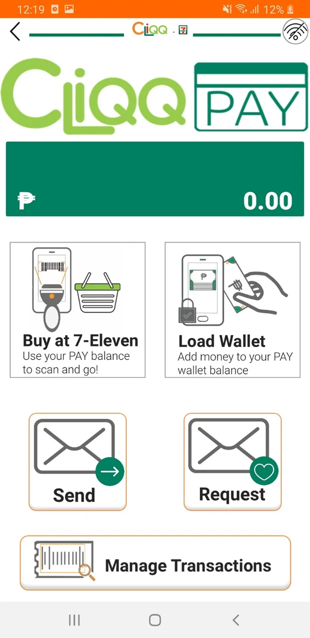
Original CLiQQ Pay screen with a large logo, a balance bar and four large action tiles
Finding featuresCLiQQ Pay has its own home, with large tiles for only a few actions.
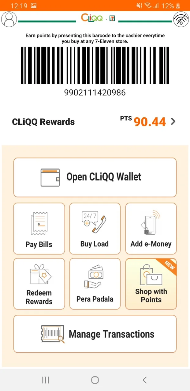
Original CLiQQ rewards screen with a barcode, points balance, a wallet button and a grid of service tiles
Understanding rewardsBarcode, points, wallet and services share one screen, with nothing explaining how points work.
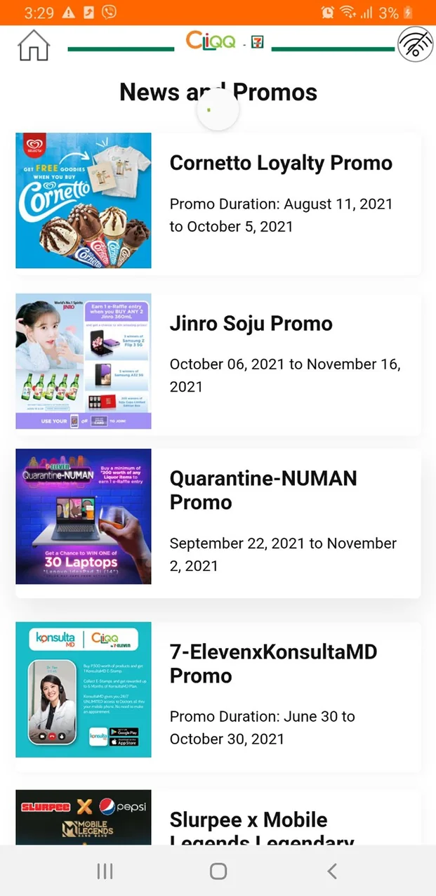
Original CLiQQ News and Promos list of promotional posters with date ranges
Discovering dealsOffers sit in a long feed of promo posters, so the deal itself is hard to scan.
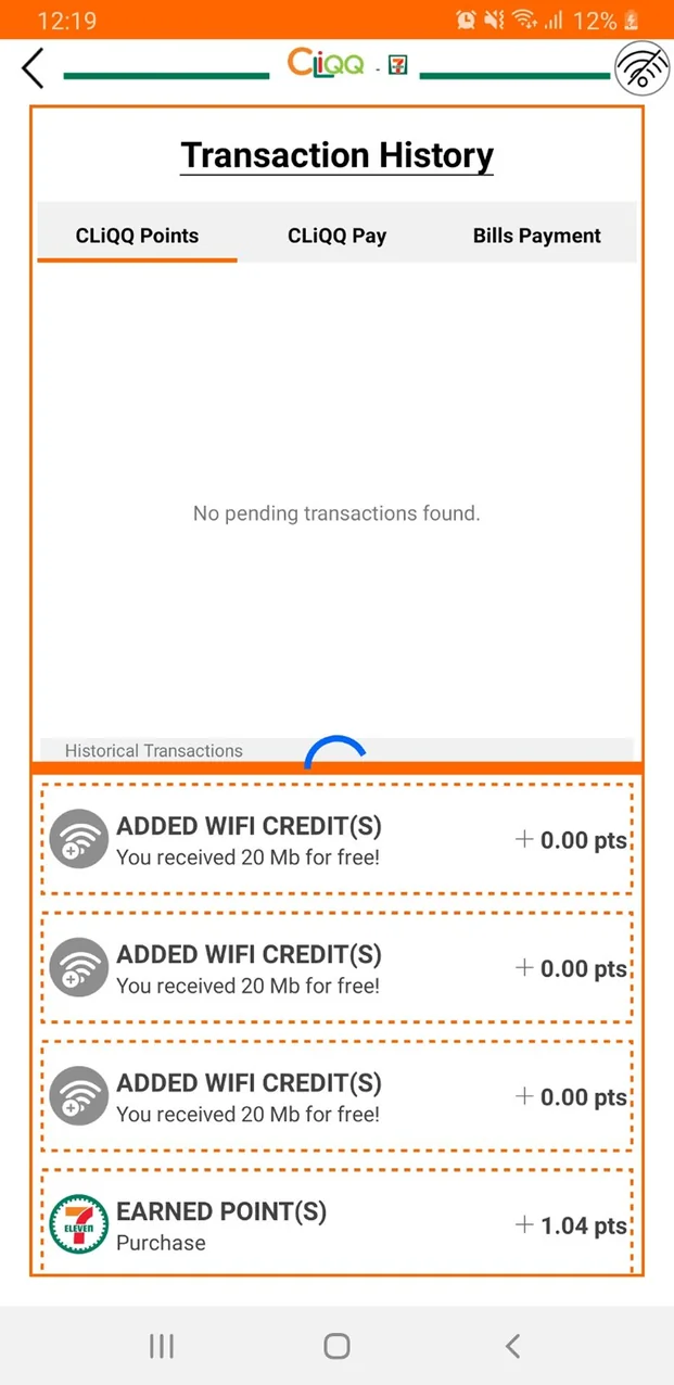
Original CLiQQ transaction history with dashed orange outlines and small text
Visual presentationDashed outlines, heavy orange and small type make history hard to read.
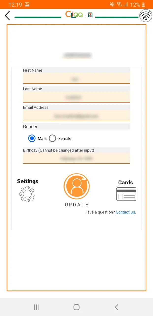
Original CLiQQ profile form with personal details blurred, and Settings and Cards icons below it
Finding featuresSettings and saved cards sit below the profile form. Personal details blurred.

Screenshots of the original CLiQQ Android app, 2021.

Design approach

Structure, hierarchy and visual consistency

1

Organize related functions

Give payments, points, and reward cards distinct places so users can identify the section relevant to their task.

2

Make important information easier to scan

Use grouping, spacing, and typography to distinguish balances, actions, and supporting details.

3

Connect function with personality

Create a shared visual language across icons and illustrations while keeping actions clearly labeled.

The redesign

Giving everyday actions a clear place

Original CLiQQ Pay home Original CLiQQ rewards home
BeforePay and Rewards each have their own home.
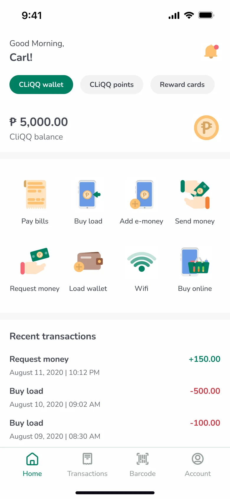
Redesigned CLiQQ home with wallet, points and reward cards tabs
AfterOne home, with wallet, points and reward cards as tabs.
01 · Home

A clearer home experience

The redesigned home separates CLiQQ Wallet, CLiQQ Points, and Reward Cards into three labeled sections, giving payment and loyalty functions more distinct locations. Within the wallet, a grid groups services such as bill payments, buying load, and adding e‑money. Each action pairs an icon with a text label, so its purpose never relies on the illustration alone.

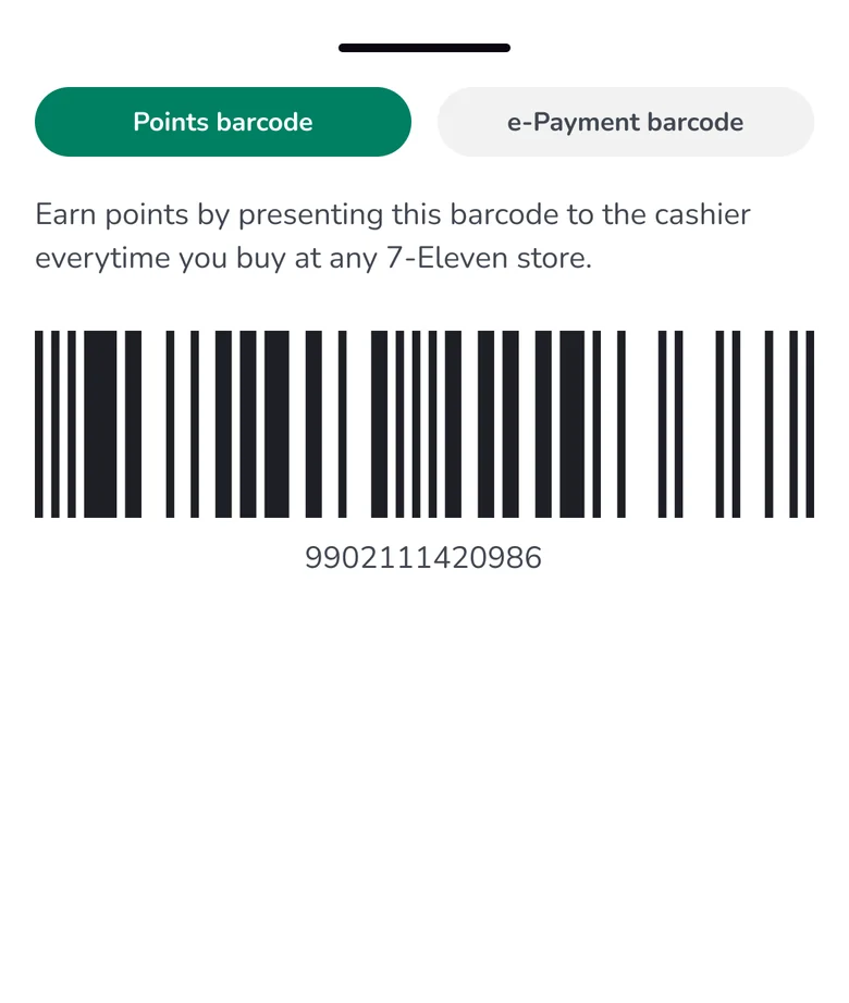
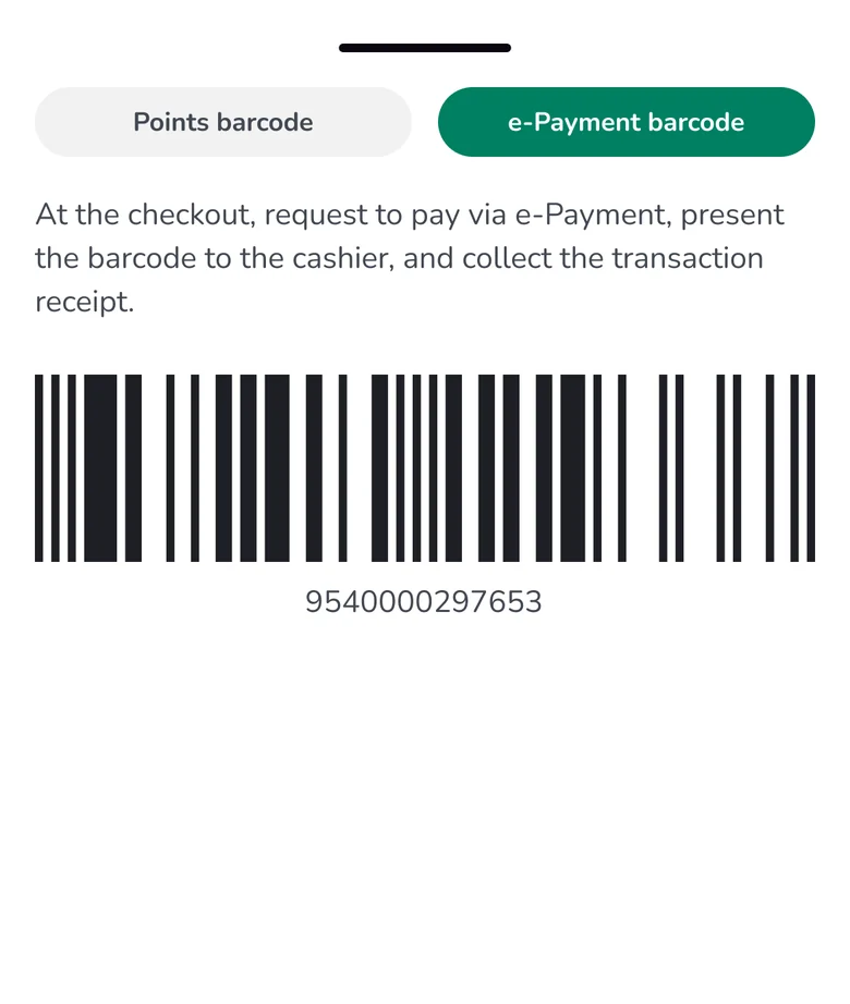
The bottom navigation gives access to Home, Transactions, Barcode, and Account. Putting Barcode there gives the checkout feature a consistent location across the main screens.

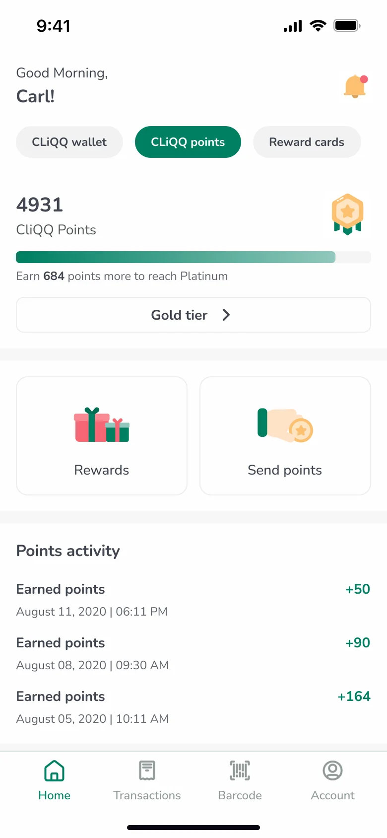
02 · Points

Making rewards progress visible

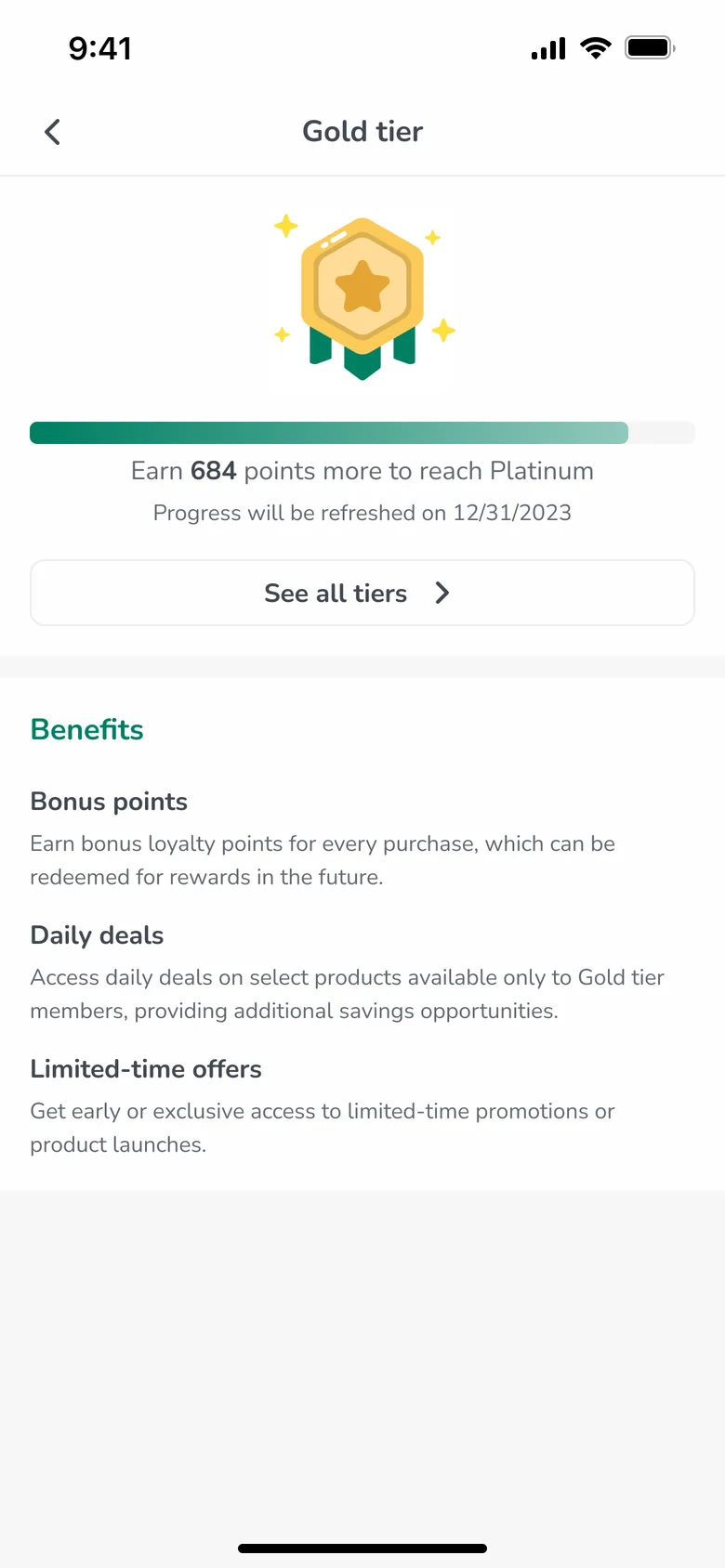
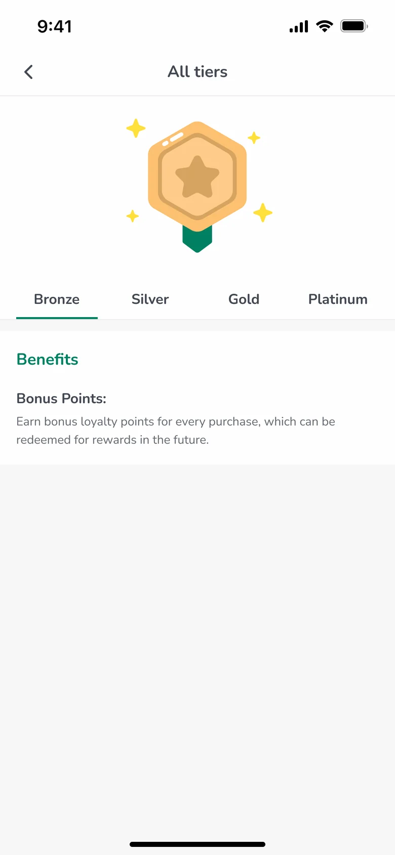
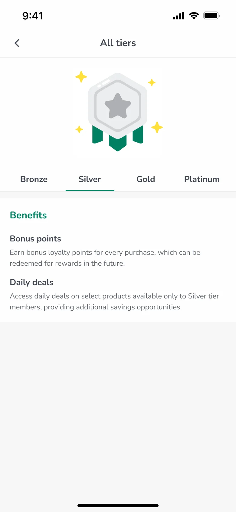
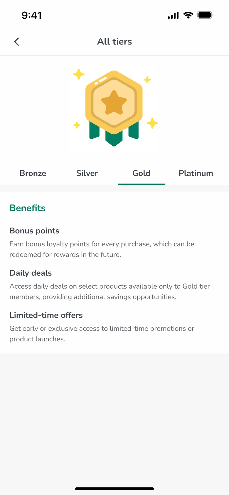
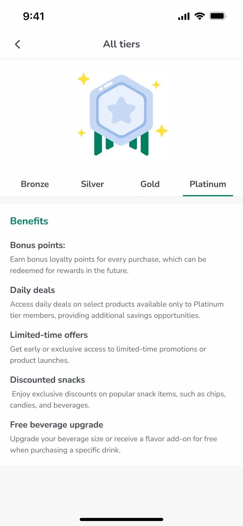
The CLiQQ Points screen brings the points balance, rewards access, and points activity into one view. I also explored a tier concept with Bronze, Silver, Gold, and Platinum levels, where a progress indicator shows the distance to the next tier and supporting text explains the points still needed. From the Points tab, the tier button opens progress and benefits for your current level, and See all tiers compares what each level unlocks.

Tiers introduce additional rules, though. Since understanding rewards was already a concern, this concept would need testing to show whether it adds useful motivation or unnecessary complexity.

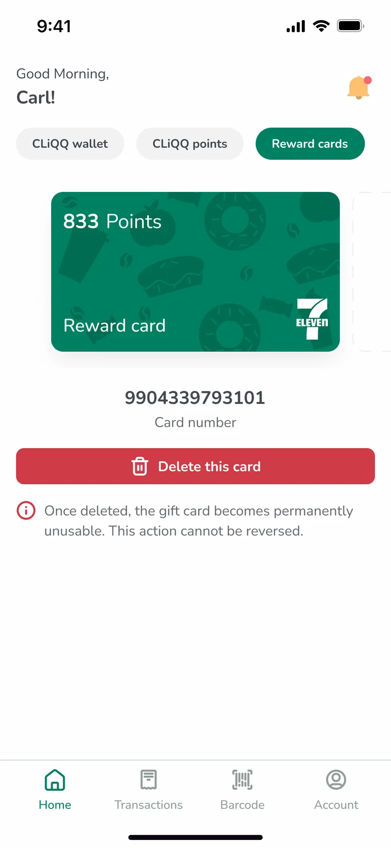
03 · Reward cards

A dedicated place for reward cards

The Reward Cards section explores how users could connect a physical 7‑Eleven reward card and see its points balance in the app. Giving card management its own section separates it from wallet services and the proposed points experience, making the function easier to locate and its purpose clearer.

Visual identity

A cohesive, approachable visual language

Iconography

Custom icons with simplified forms and a consistent illustration style. They bring personality to service shortcuts, while labels explain each action so nobody has to decode an unfamiliar symbol.

Typography

Nunito, chosen for its rounded shapes and range of weights. Its character suits the illustrations, and changes in size and weight separate headings, balances, action labels, and supporting text.

Joe cheering

Joe and Lala

Two recurring characters with rounded shapes, expressive faces, and bright clothing, carrying the visual language across onboarding and supporting content. Any effect on engagement or trust would need validation.

Final screens

One visual direction, end to end

Home across its three tabs, plus the barcode sheet that sits one tap away in the bottom navigation.

Reflection and next steps

Looking clearer isn't the same as being easier to use

This project connected visual craft with practical product tasks. The outcome is a redesign concept and a cohesive visual direction; its usability benefits remain hypotheses. The next step is testing the prototype around four tasks:

  • 1Accessing the payment barcode
  • 2Finding a payment or shopping service
  • 3Checking a points balance
  • 4Locating a reward and understanding how to redeem it

I'd also evaluate the proposed loyalty tiers, small text readability, and interface contrast.

Next

More projects

← Back to all work