A new Members Portal bringing healthcare services into a responsive interface, with clearer navigation and guided flows for consultation bookings and medical test requests.

Maxicare needed a new Members Portal to replace an outdated interface and expand the services available to its members. The project involved a new portal structure alongside an updated visual design, helping members access healthcare services and manage appointments while accommodating functionality beyond the original platform.
This case study focuses on my contribution to the portal's UI, from low fidelity wireframes to responsive high fidelity designs.
As an individual contributor, I created low and high fidelity designs and illustrations, and worked on the design system for the Members Portal. The CX Designer led research and user journey mapping, while I took part in affinity mapping sessions to help organize findings and inform the interface work.
My focus was translating requirements and user journeys into screen layouts, clear information hierarchy, and consistent visual patterns across the portal.
We needed to introduce more functionality while keeping the experience understandable. For my interface work, that meant considering how services were grouped, how actions were presented, and how detailed tasks could be broken into manageable screens.
Members struggled to locate important features and access services.
The existing platform offered basic features that did not fully support members' needs.
The visual presentation needed to evolve alongside the portal's expanded capabilities.
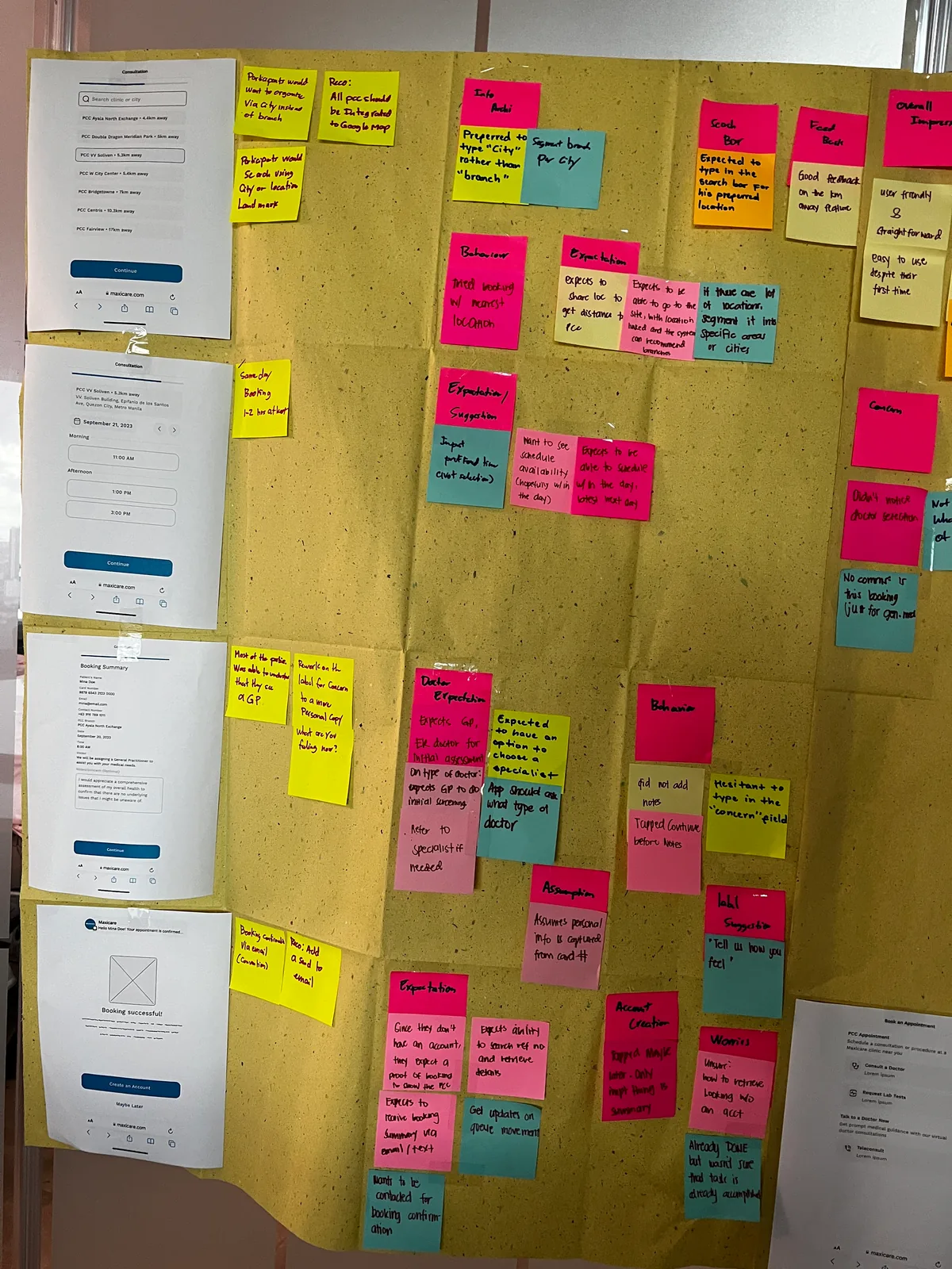
The CX Designer led research into members' needs, pain points, and healthcare journeys. In affinity mapping sessions, the team grouped findings and identified themes. They pointed to a preference for:
These findings gave direction, and were weighed against the portal's policy selection and verification requirements rather than treated as features to implement automatically.
Low fidelity wireframes explored how the expanded functionality could fit into the portal: where information sits, how services are reached, and the order of decisions in each flow. They gave the team a way to review the experience before committing to visual design. Once approved, they became the foundation for the high fidelity designs.


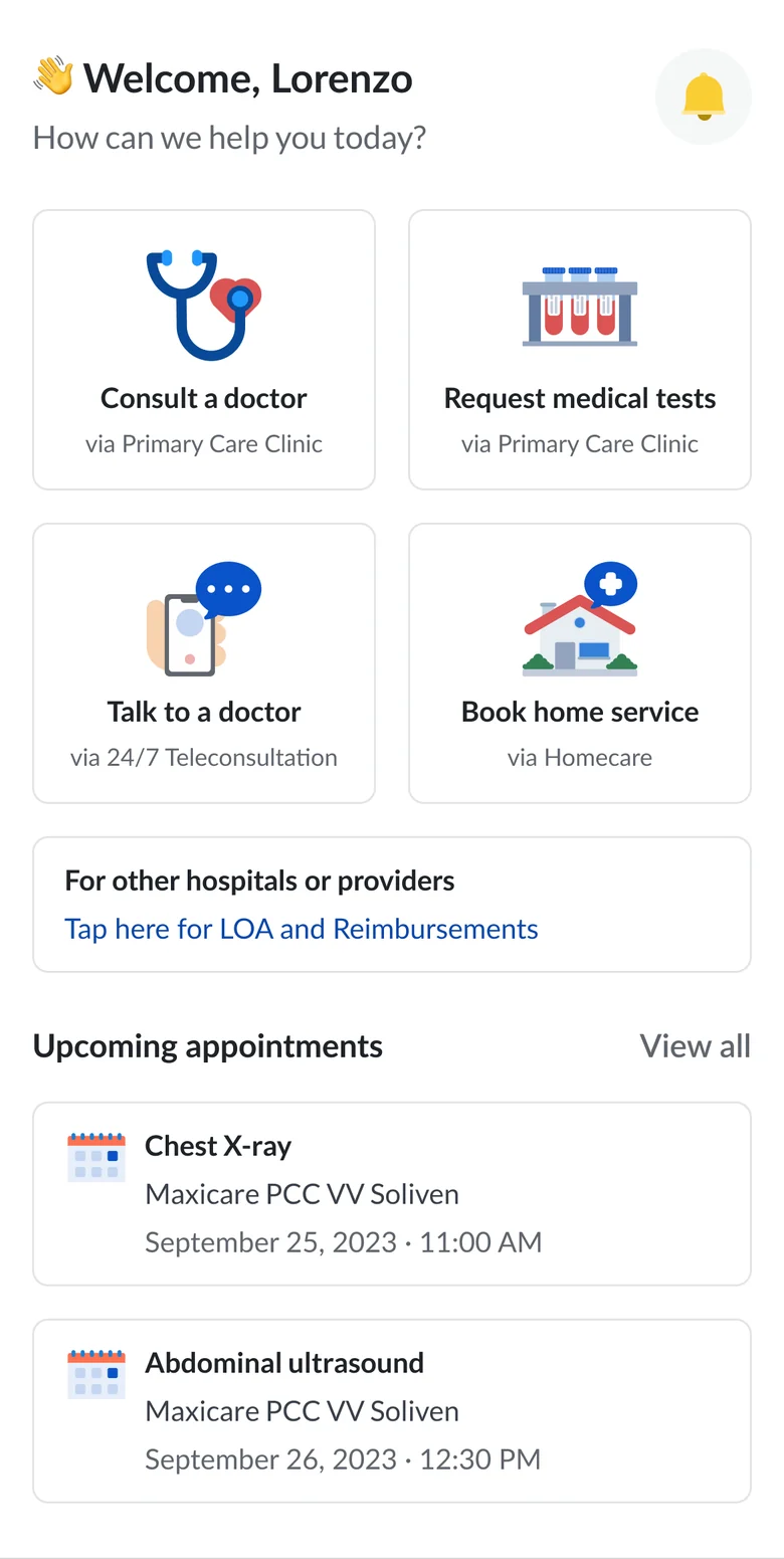
The high fidelity designs introduced an updated interface aligned with Maxicare's branding. Layout, spacing, typography, and grouping separate supporting details from the controls members need to use.
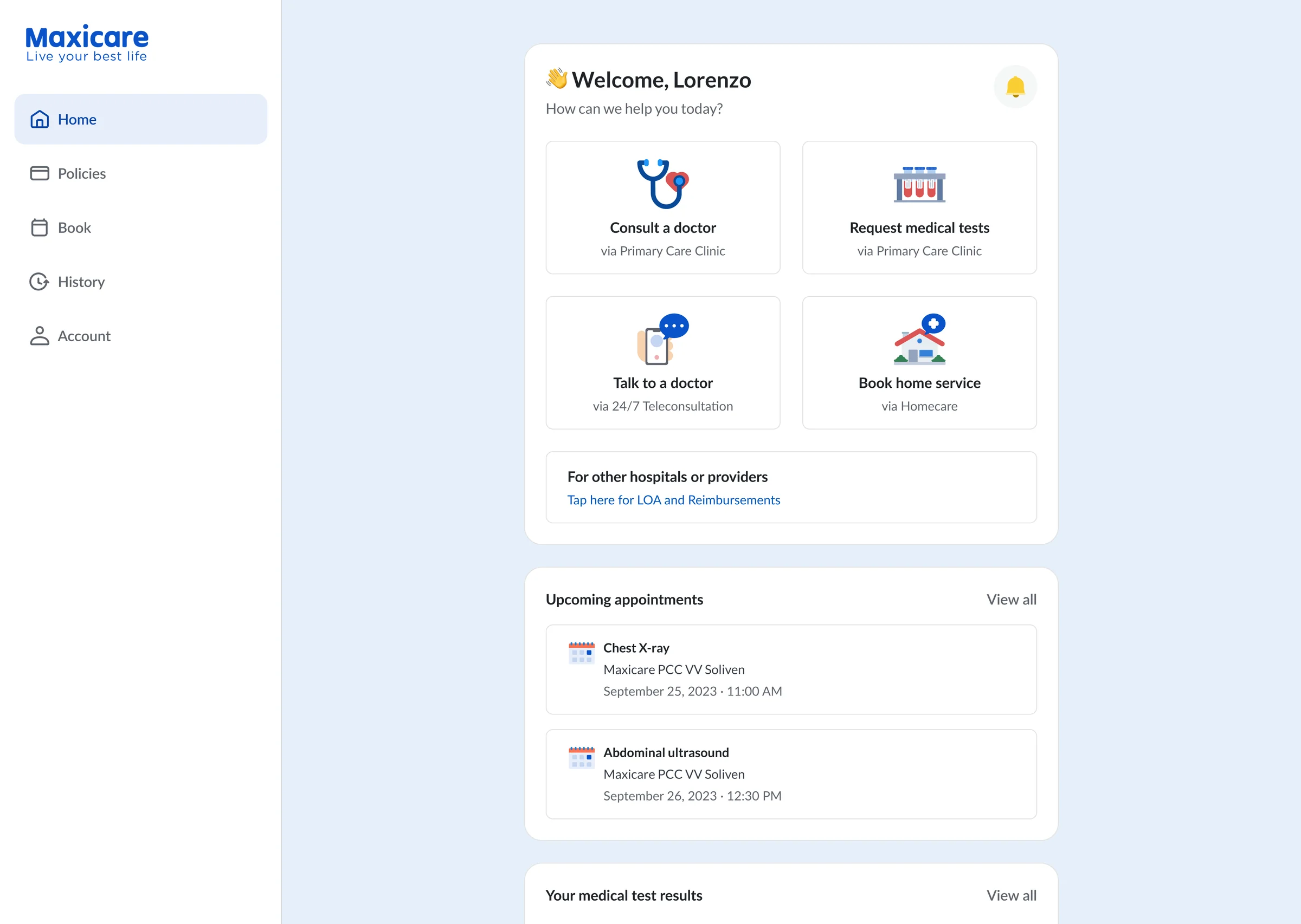
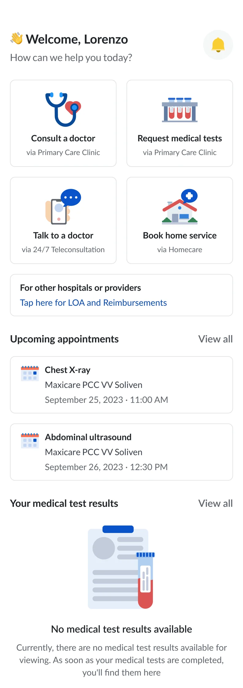
Related screens needed to feel connected even when they supported different tasks, so a shared visual language runs across the portal while each service presents its own requirements. The dashboard tracks upcoming appointments, connecting the booking flows with the wider portal.
The Members Portal is a responsive Progressive Web Application. I designed desktop and mobile layouts, adapting the presentation to the available space while keeping the same hierarchy and visual direction, so services, appointment information, and actions sit in layouts suited to each screen size.
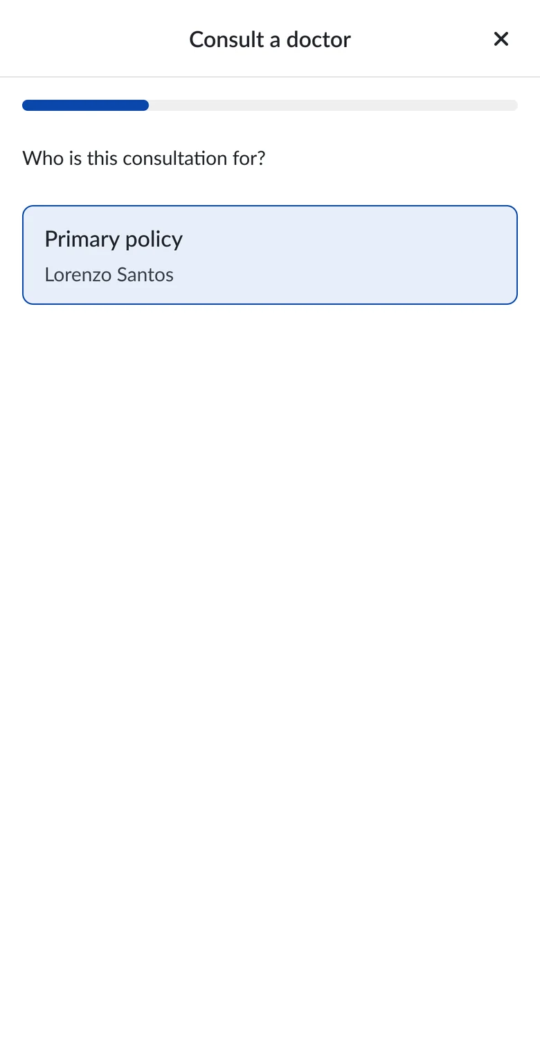
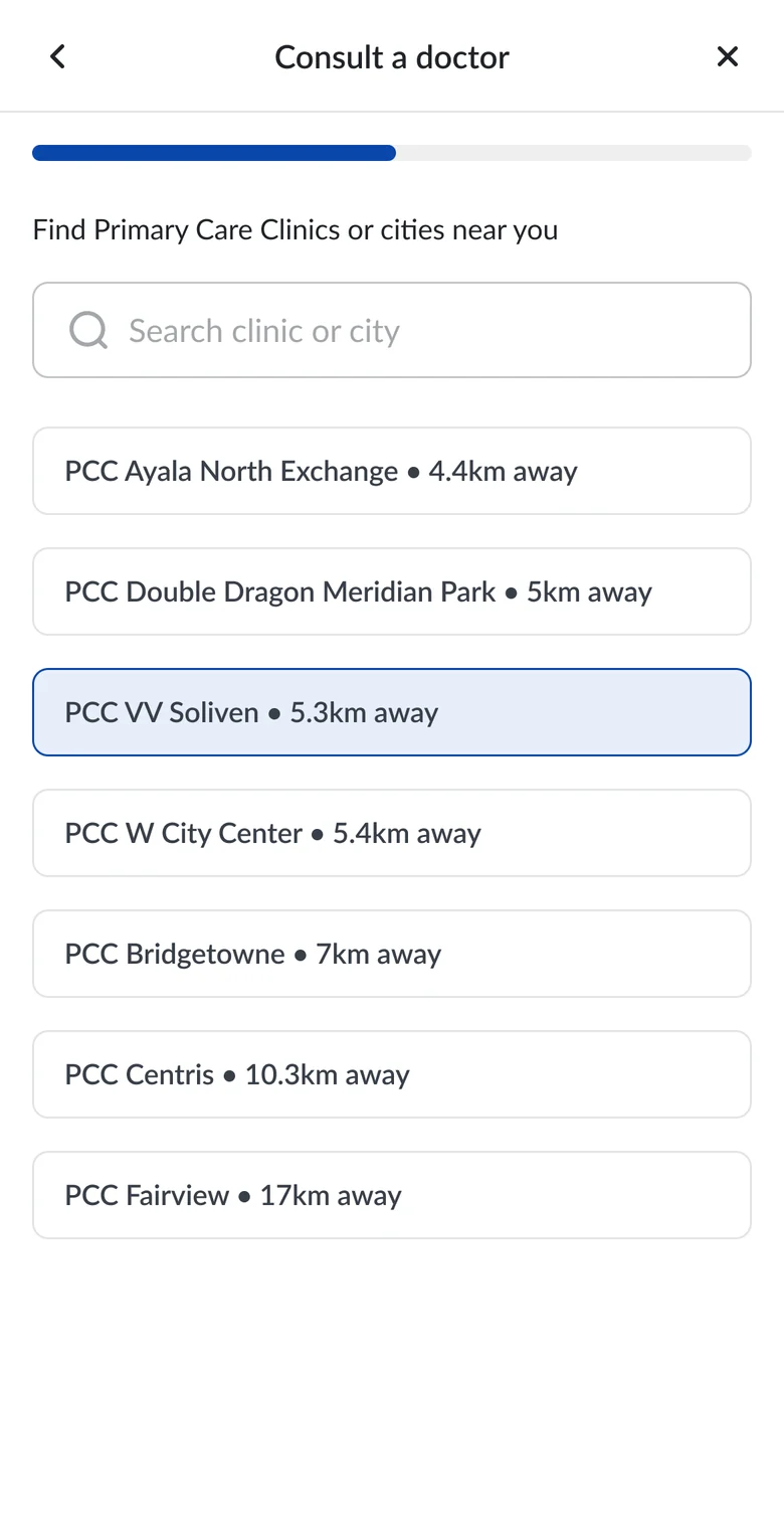
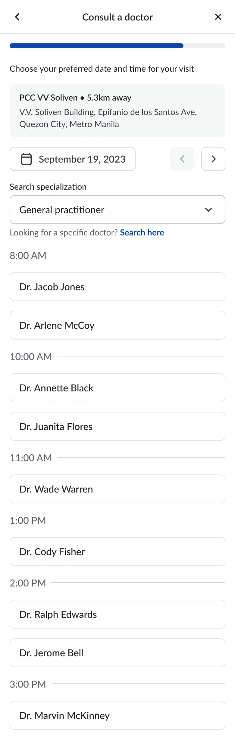
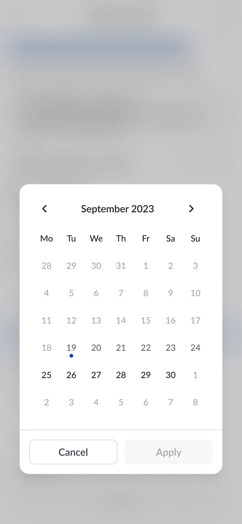
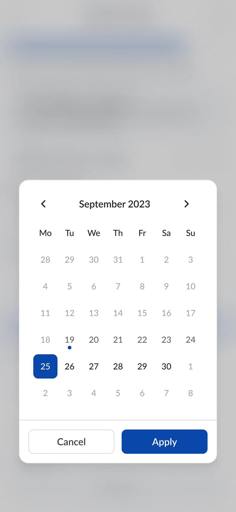
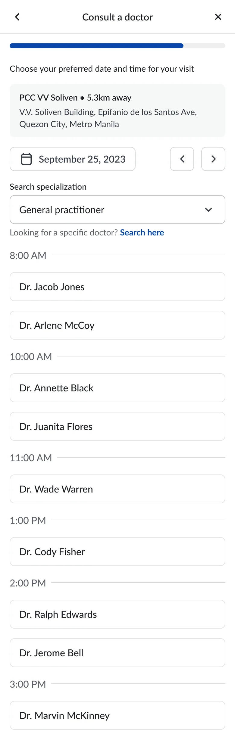
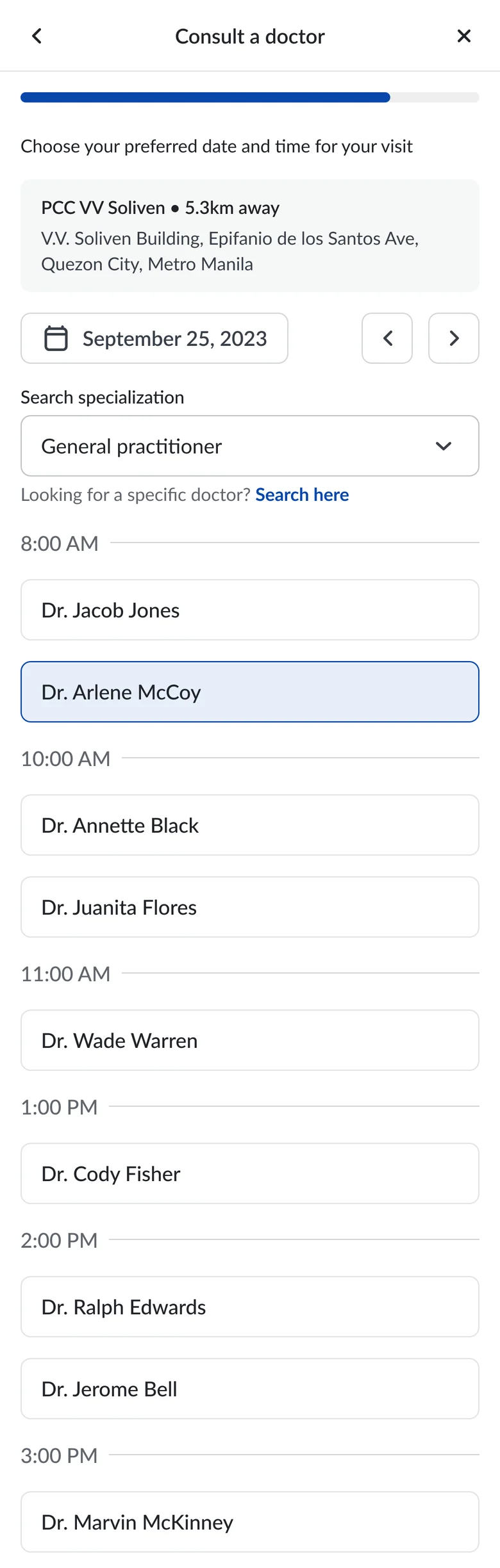
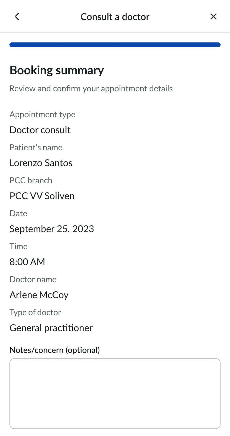
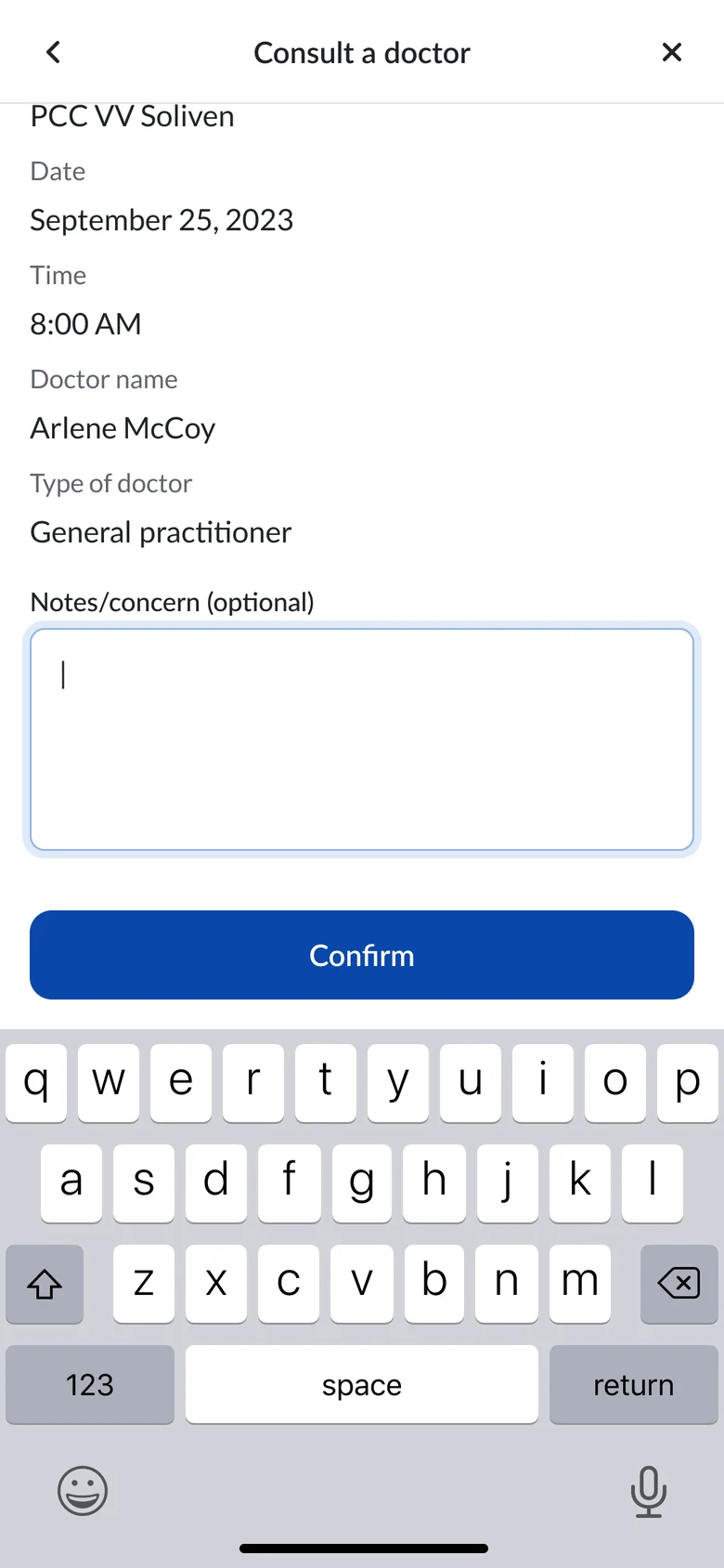
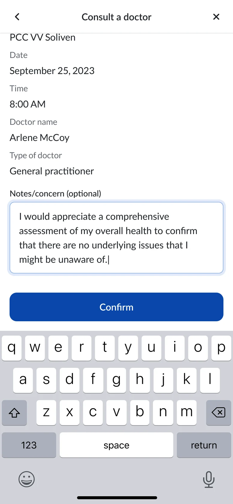
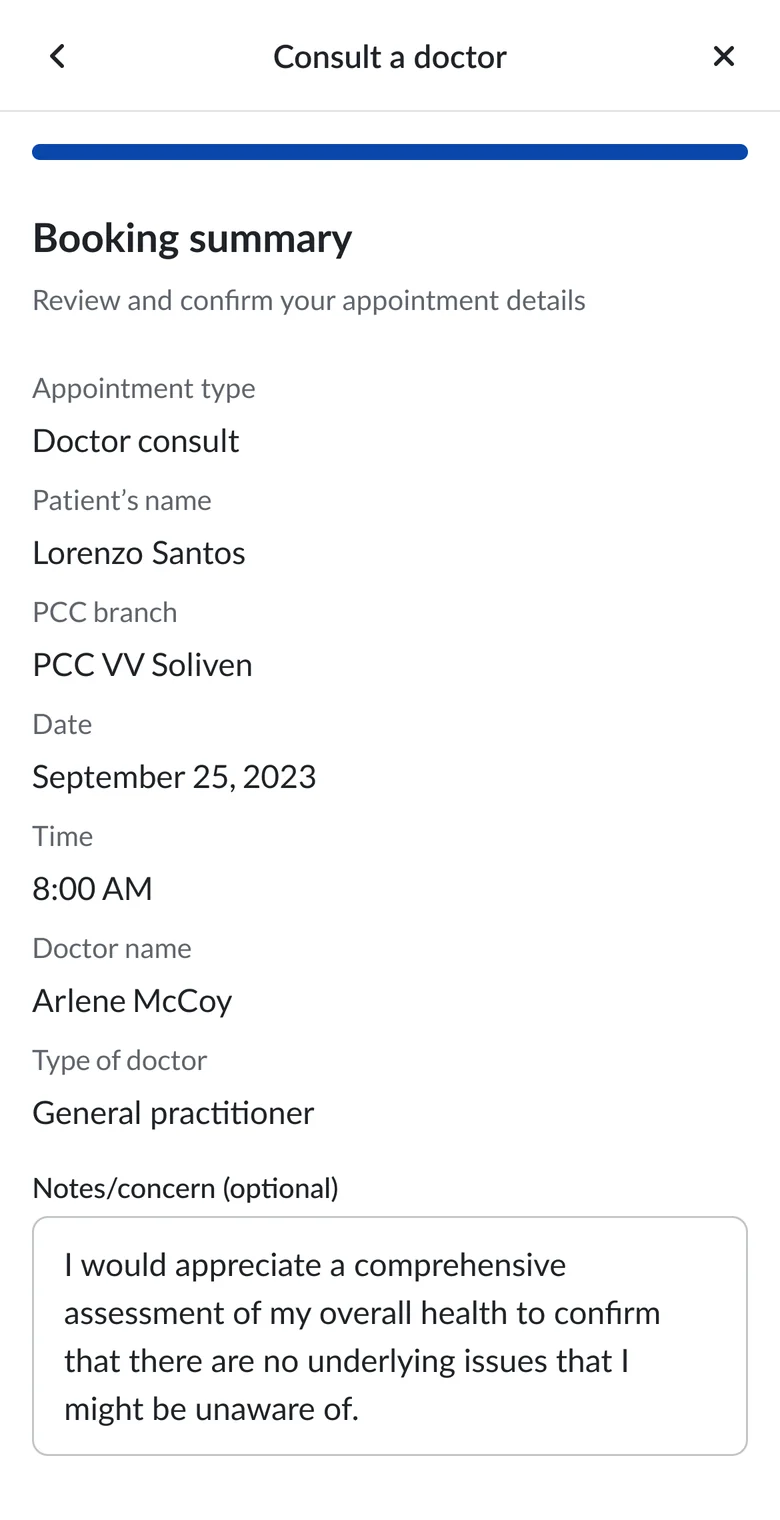
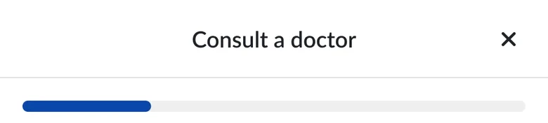
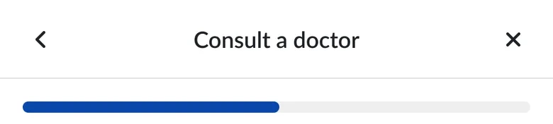
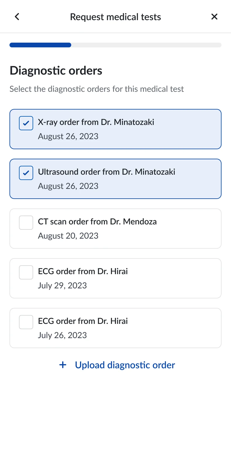
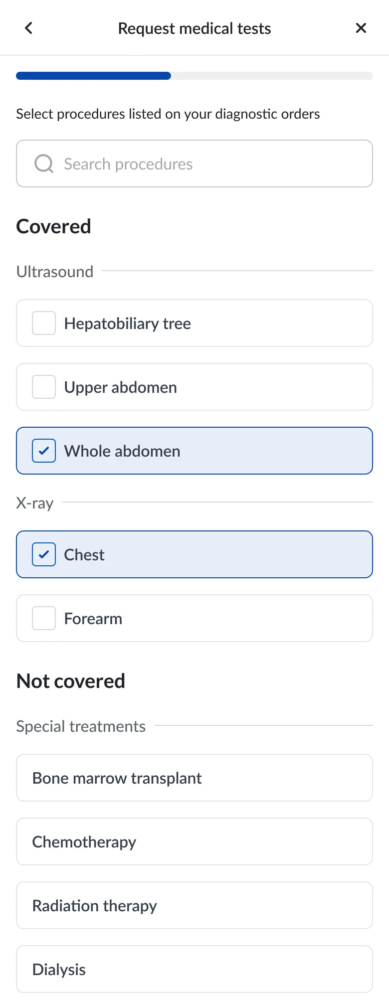
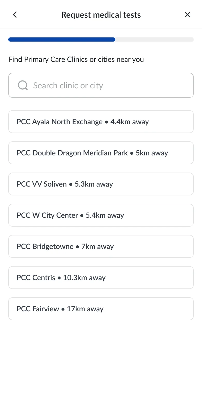
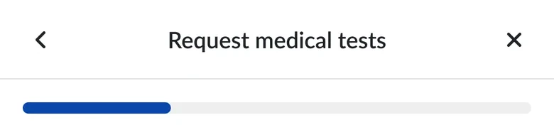
The consultation flow guides members through a sequence of selections, with a progress indicator showing where they are. Each screen focuses on the information needed for the current choice rather than presenting every decision at once.


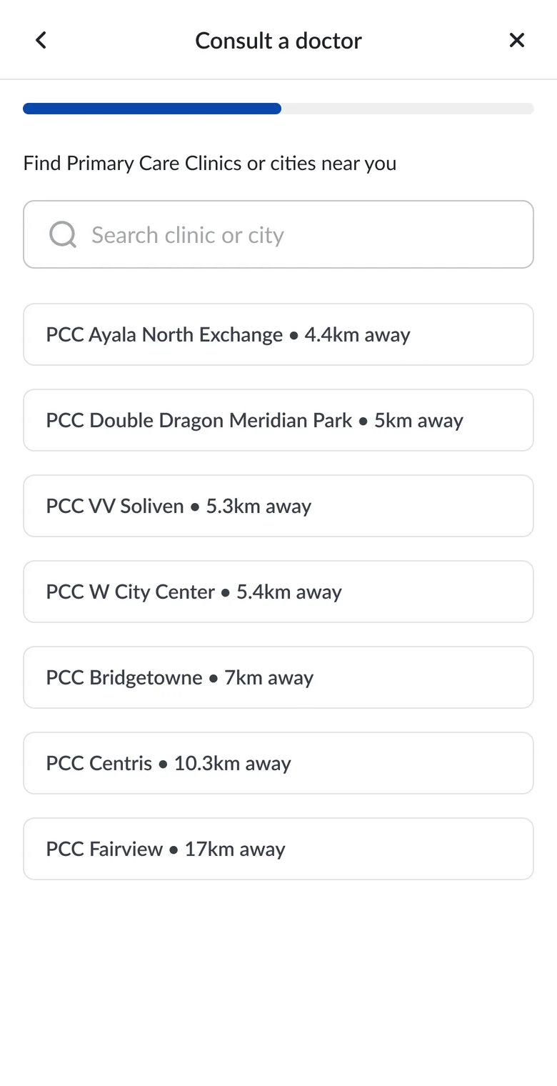
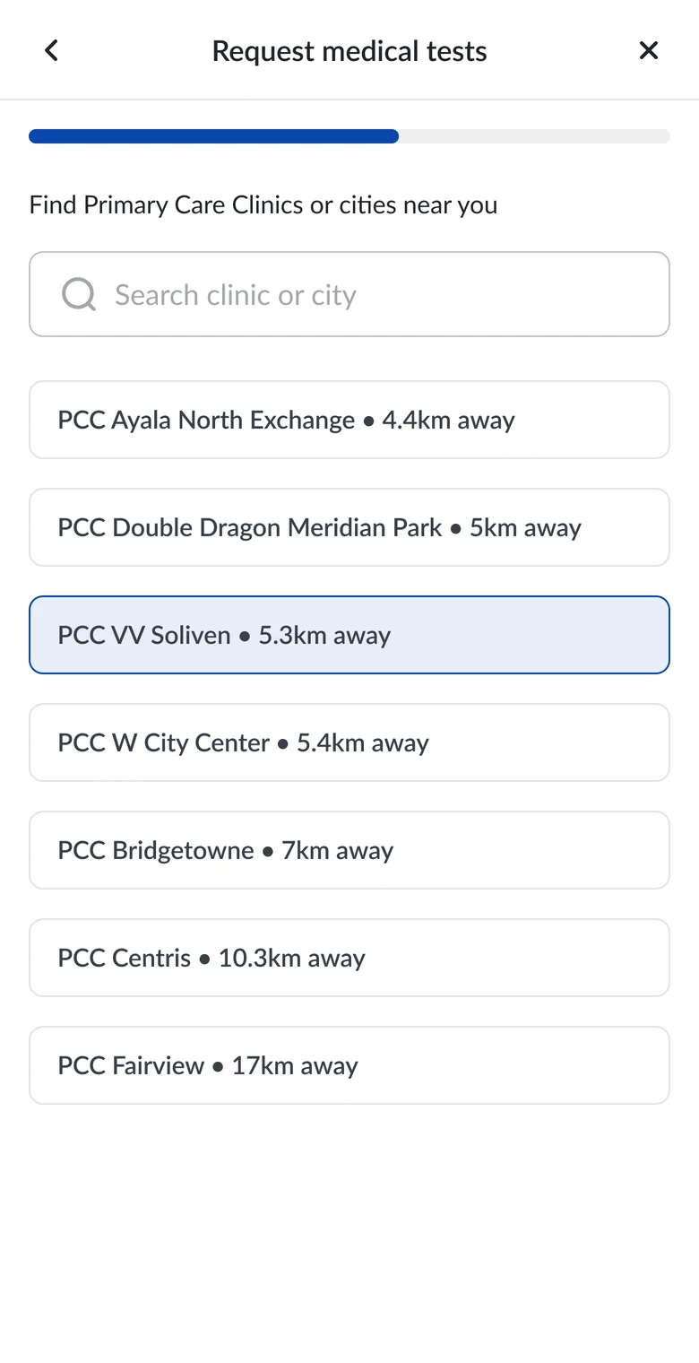
Clinic selection combines search with distance information, supporting the finding that location matters when choosing a provider. The designed flow includes email and mobile notifications, with upcoming appointments on the dashboard.
Select a step to jump to it.
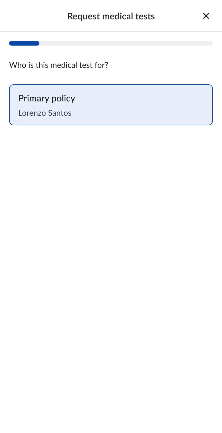
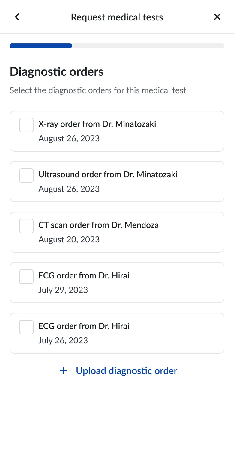
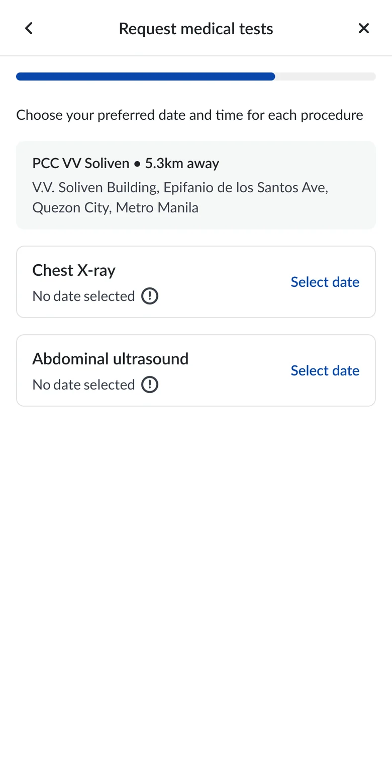
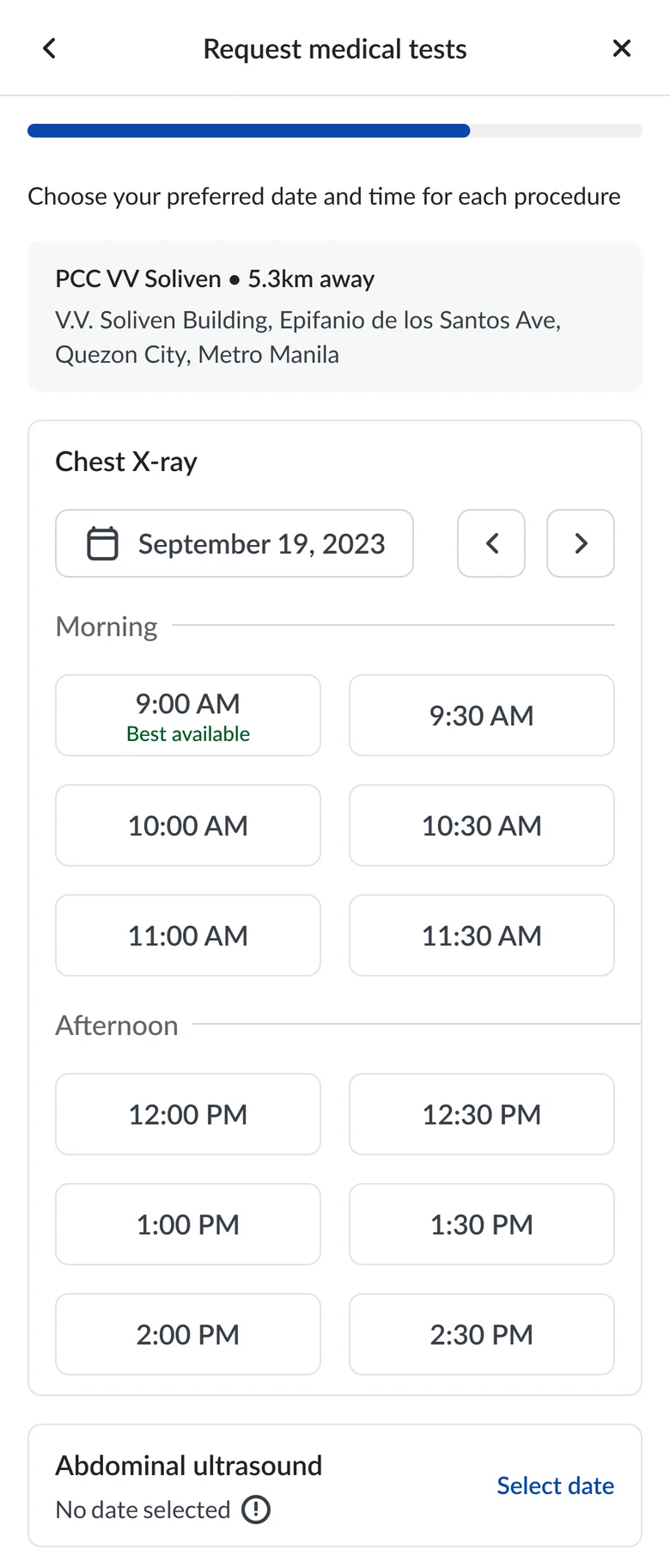
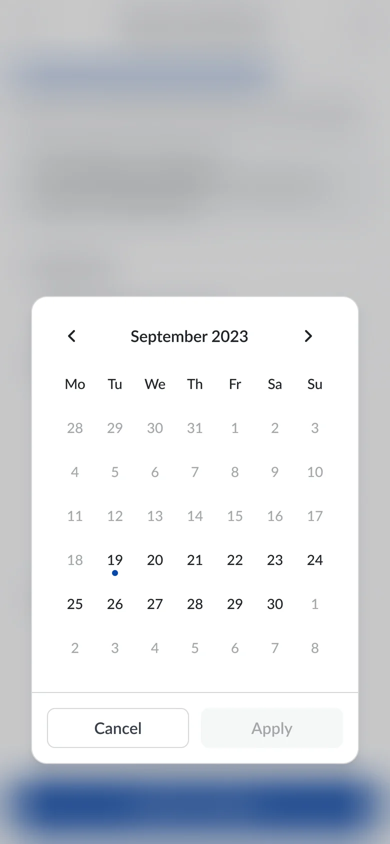
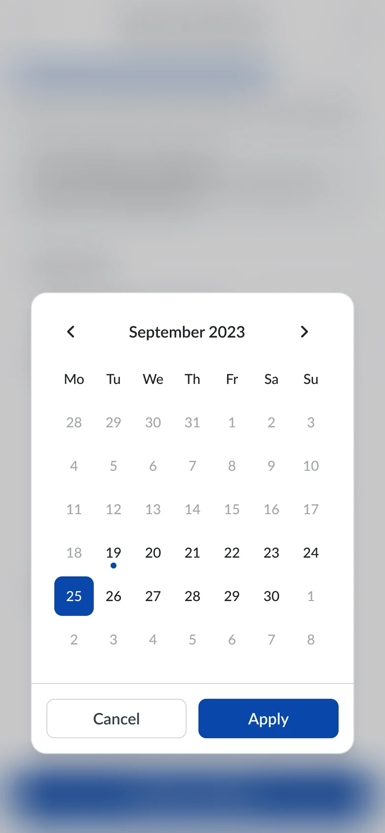
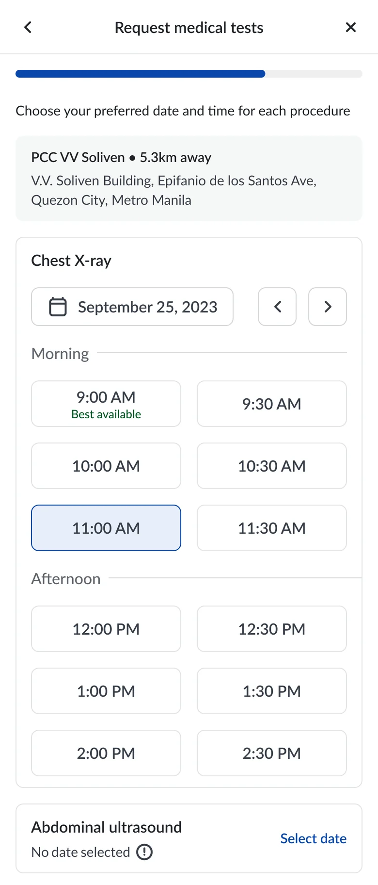
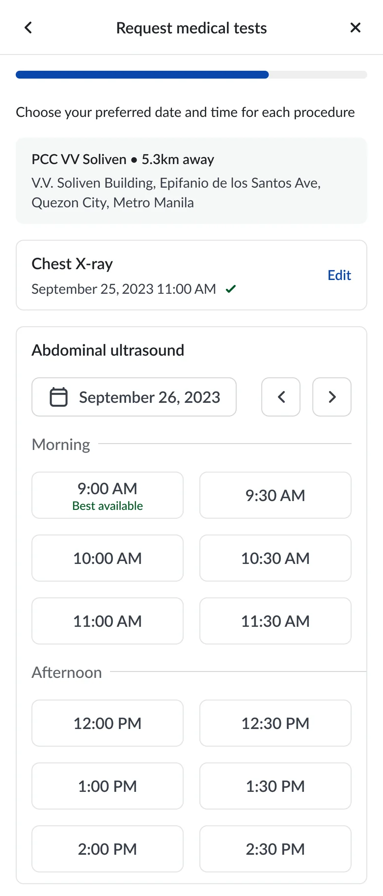
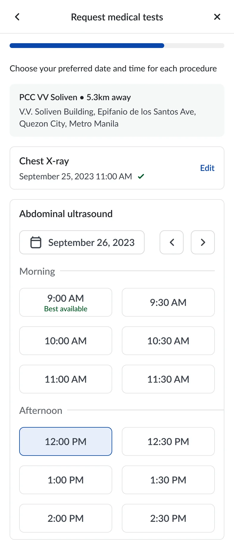
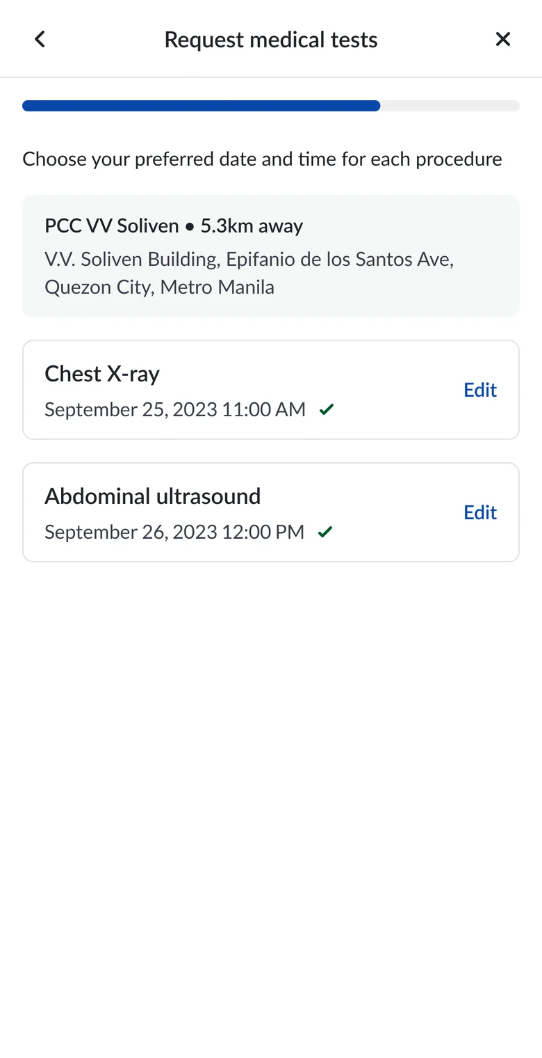
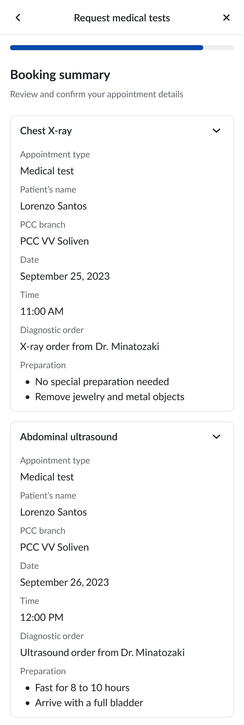
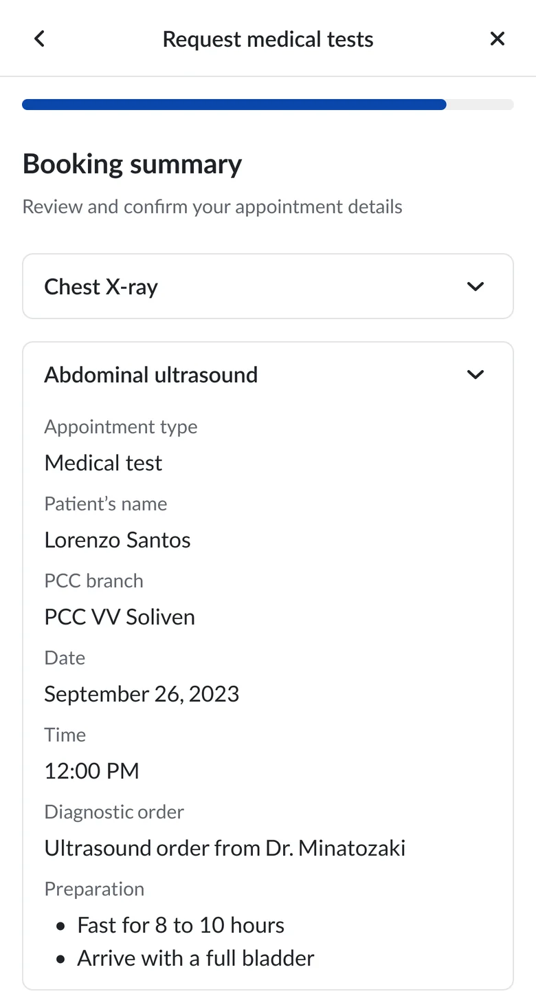
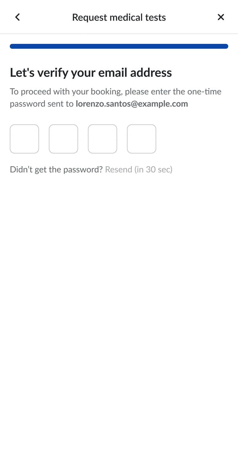
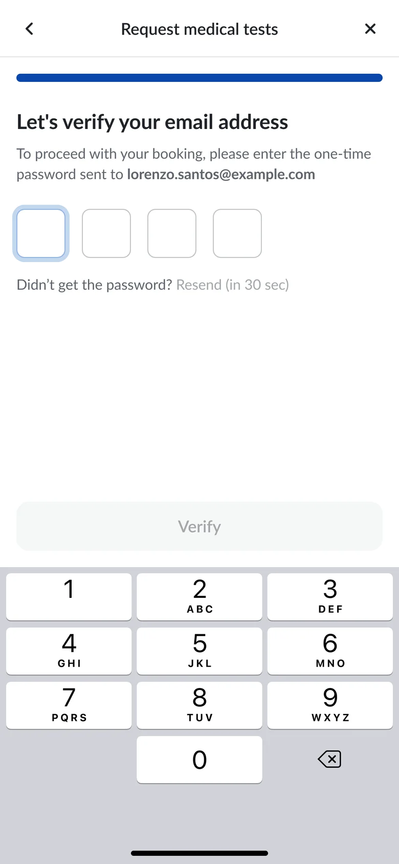
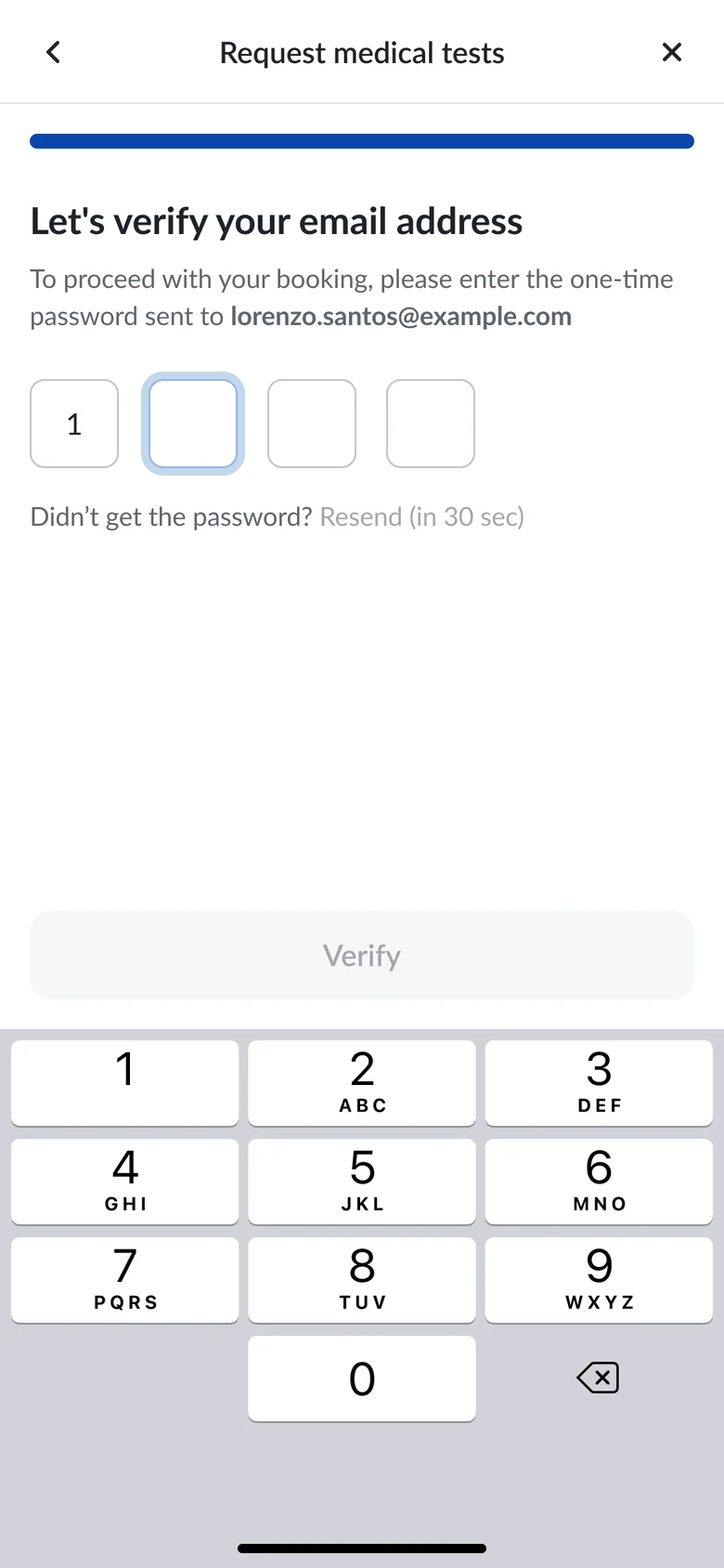
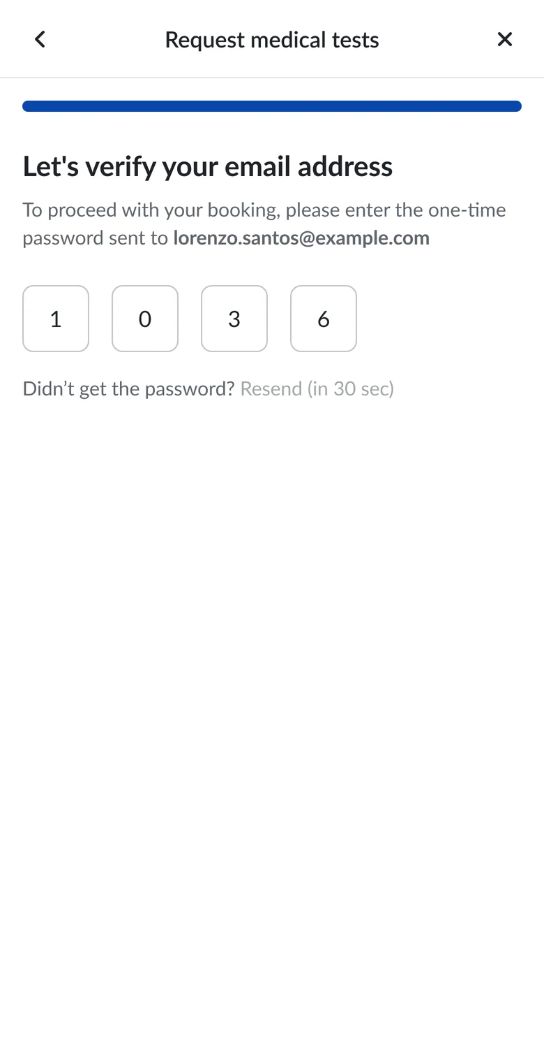
Medical test requests need a different set of information from consultation bookings. My interface work addressed these service specific requirements while staying visually consistent with the consultation flow and the rest of the portal.
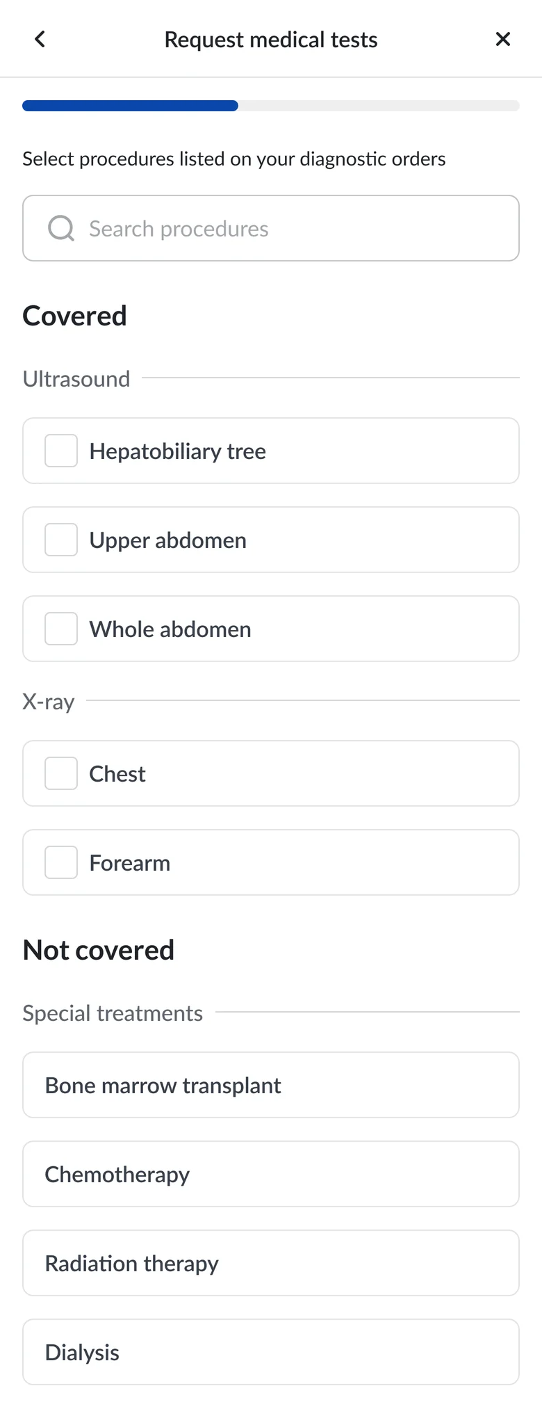



Appointments then appear on the dashboard, with notifications supporting updates.
Select a step to jump to it.
The approved designs went to the development team with supporting materials, and the design team stayed close to clarify details during implementation.
The intended layouts and interactions, written down.
How each flow behaves, as a reference during implementation.
Exported for the development team to build with.
This project let me apply UI and visual design inside a collaborative healthcare product team, connecting user journeys and requirements with screen structure, hierarchy, responsive layouts, and visual consistency. Consultation booking and medical test requests had different requirements, but both needed to feel like the same Members Portal.